B2B SaaS Fleet Dashboard Design
A research-driven UX initiative that replaced report-based workflows with a real-time B2B SaaS dashboard. It surfaces alarms, cargo status, and operational exceptions to improve response time and decision-making at scale.
Fewer Workflow
Steps
Cut the workflow from 4 steps to 2 by removing report navigation and filtering.
Faster Issue Identification
Simplified workflows reduced the time needed to detect alarms and fleet issues.
Increased Fleet Visibility
Consolidated data from multiple reports into a real-time dashboard.
Project Overview
Fleet operations teams relied on multiple reports to track alarms -- cargo, dwell, and movement -- requiring filters, cross-checks, and manual searches. This UX-led project created the platform's first Fleet Dashboard, replacing that with a real-time operational view. I led research, wireframes, and design in collaboration with Product, Engineering, and SMEs. Based on user interviews and competitive analysis, the dashboard delivered major efficiency gains and became the most-used page within a month.
-
My RoleLead UX Strategist
-
TeamProduct Management, Engineering, SMEs, and external fleet operations users
-
ToolsFigma, Balsamiq, User Interviews, Competitive Analysis, UX Research
-
Timeline3 Months
-
Business GoalsImprove operational efficiency, reduce time-on-task, streamline decision-making, and surface critical fleet data in real time.
-
Key User and Business Problem SolvedUsers previously relied on multiple reports, filters, and manual checks to monitor fleet status, alarms, and dwell. The dashboard centralized this into a single real-time view, eliminating unnecessary steps and reducing friction.
The Challenge: From Manual Reports to Real-Time Visibility
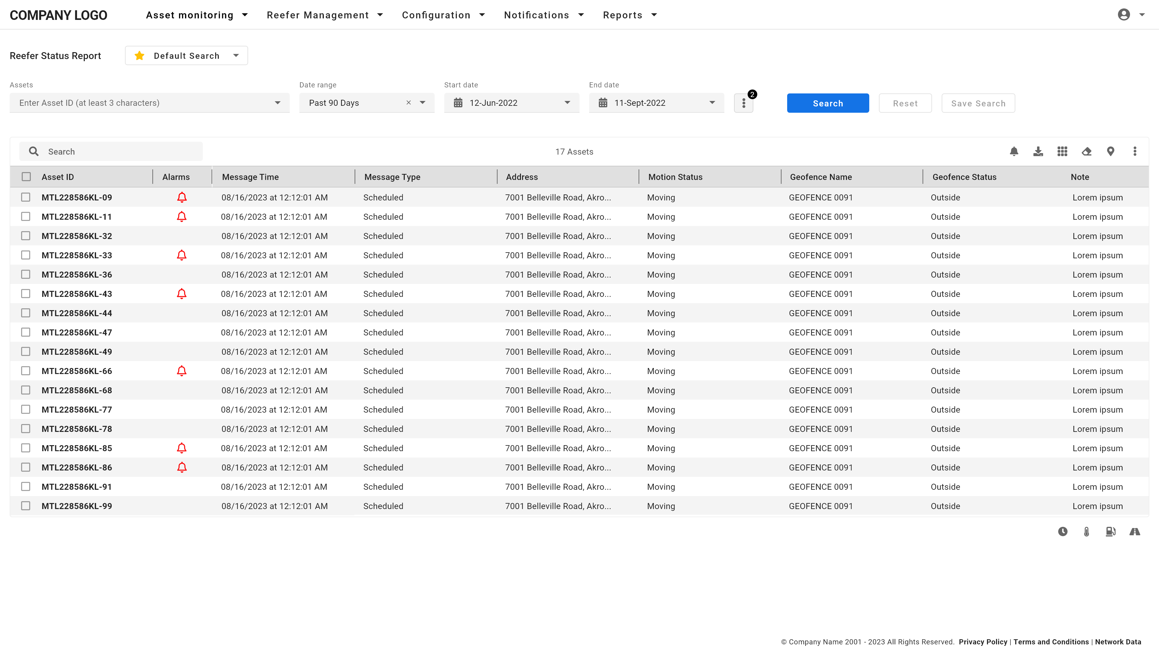
Before the dashboard, fleet teams had no operational overview. Monitoring alarms, cargo, dwell, or movement meant opening multiple reports, like Reefer Status or Location Tracking, applying filters, and scanning through raw data. This was slow, error-prone, and a constant source of frustration.
Different users needed entirely different views. A reefer-only operator, a dry fleet dispatcher, and a mixed-fleet customer support rep all had distinct priorities. No single default dashboard would work for everyone, which made customization a critical design requirement. Version 1 allowed users to show or hide cards; Version 2 on the roadmap would support rearranging them, which introduced technical complexity with layout rules, grid behavior, and scaling constraints.
-
Operational Blind Spots
Relying on static reports meant users had no real-time view of fleet status. Since the data was constantly updating from IoT tracking devices, users had to keep checking the Reefer Status Report for the latest alarms, motion status, or disconnects, which added friction and delayed response time. -
Workflow Inefficiency
Routine tasks were tedious. Something as simple as checking for shutdown alarms meant logging into the Reefer Status Report, applying filters, and scanning rows of data manually, which wasted minutes every time the user had to check.
-
One-Size-Fits-None Was a Real Problem
Mixed fleet managers, reefer-only operators, and dry fleet dispatchers had radically different priorities. This wasn't anecdotal. It was validated through both interviews and behavior tracking. Some users focused entirely on reefer alarms. Others prioritized dwell time or cargo status. This directly validated the need for a modular, customizable dashboard, as well as the role-based default views we shipped for Fleet Managers, Customer Support / Operations / Dispatch, and a general fallback group. -
UX and Engineering Constraints
Allowing cards to be shown/hidden, and eventually reordered, created layout challenges. Not all cards were the same size, and maintaining a clean, scannable grid under these conditions required deliberate rules for how the UI would flex and scale.
The challenge was clear: How could we transform a report-driven workflow into a real-time, flexible dashboard while balancing operational clarity, customization, and technical constraints?
I'm piecing things together from multiple reports. There's no single place where I can just see what's going on with my fleet.
— Fleet Manager, User Interview
My Role and Strategic Approach
I led the UX strategy from problem framing through research, design, and validation. My approach combined qualitative interviews, SaaS product analytics, and usability testing to align user needs with business goals.
Research and Discovery
We started with user interviews across key roles -- Fleet Managers, Customer Support, and Operations -- to uncover workflow pain points. A common theme emerged: too much time spent navigating reports, filtering, and cross-checking data. One fleet manager summed it up: 'I'm piecing things together from multiple reports. There's no single place where I can just see what's going on with my fleet.'
In parallel, we used Pendo product analytics to validate patterns. Drop-offs during report filtering and high repeat visits for alarm checks confirmed the workflow was inefficient.
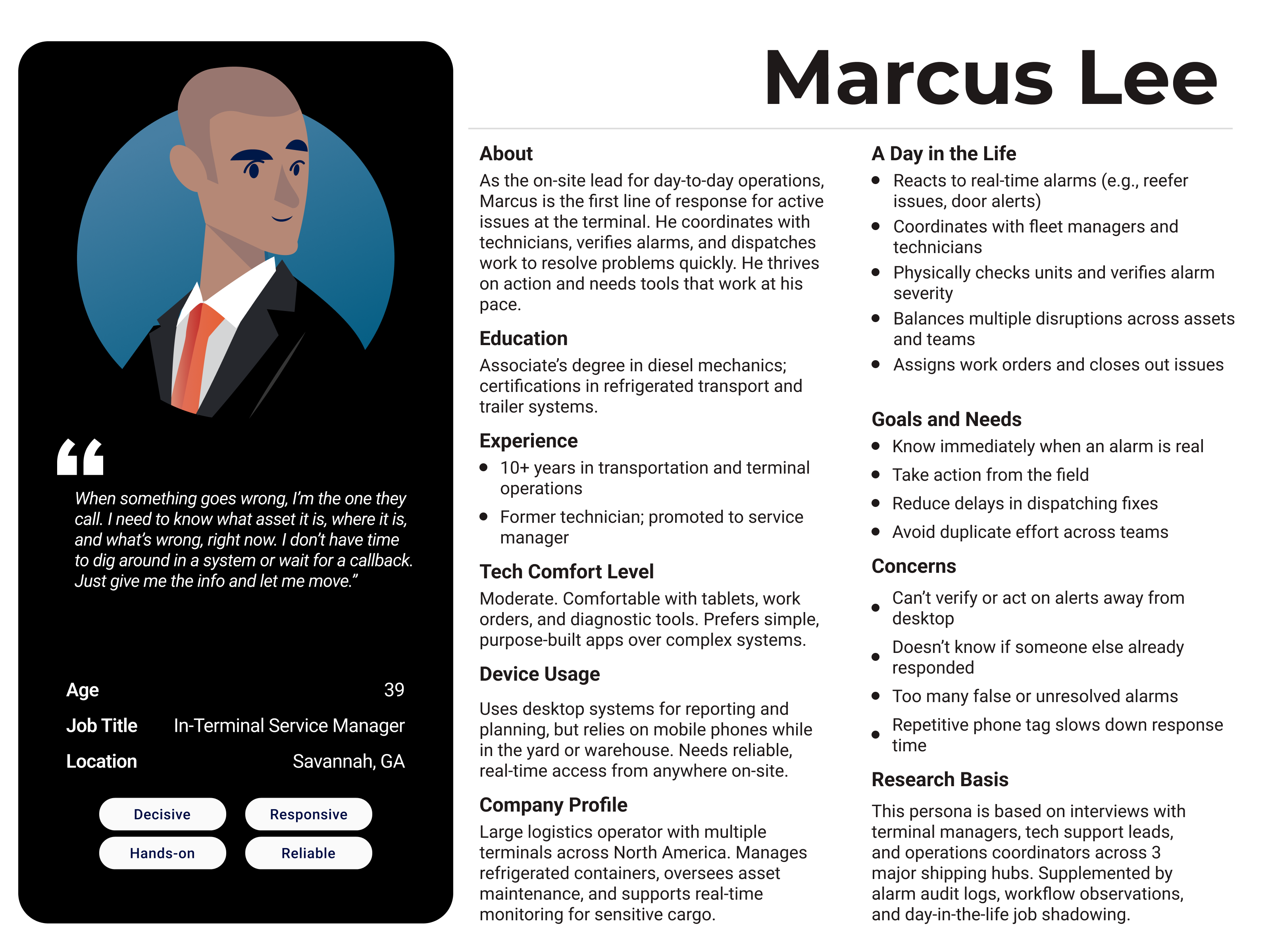
We also created actionable personas, including Marcus Lee, an Operations Manager, whose need to prioritize alarms and fleet status directly shaped dashboard customization.
Mapping Workflow Friction
We mapped the legacy workflow: log in, navigate to the Reefer Status Report, apply filters (e.g., Shutdown alarms), wait for results, and repeat -- averaging 4 steps per task. The dashboard reduced this to 2 steps: log in and click an alarm card. Time-on-task analysis using Pendo sessions confirmed a 50% reduction in steps and 30% faster issue identification.
Test-Driven, Collaborative Design
Wireframes in Balsamiq evolved into high-fidelity prototypes in Figma. We collaborated closely with Product, Engineering, and SMEs to ensure the design supported different fleet types -- reefer-only, dry-only, and mixed -- with flexible defaults and alarm configurations. We also reviewed competitive SaaS dashboards to validate common design patterns like modular cards, role-based defaults, and clickable alarm summaries, which ensured the design met user expectations and SaaS UX standards. The launch also included a redesign of the platform's global navigation, replacing top-heavy links with a left-aligned nav more consistent with modern SaaS layouts.
-
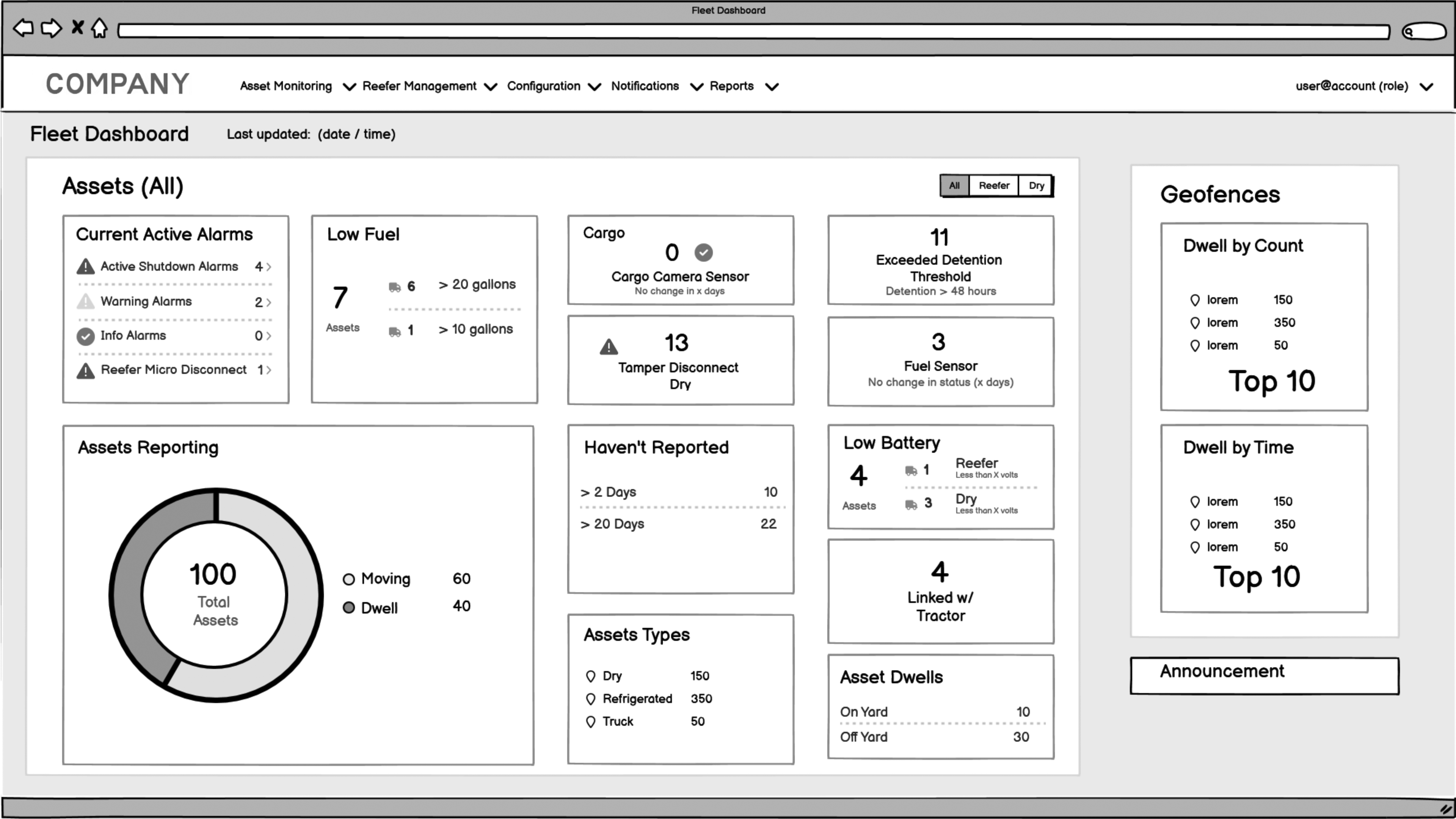
Fig 3: Early wireframe for the general Fleet Dashboard view. This concept emphasized a role-neutral layout showing alarms, movement, and fuel data across the full fleet. Card-based modules replaced manual filtering across multiple reports. -
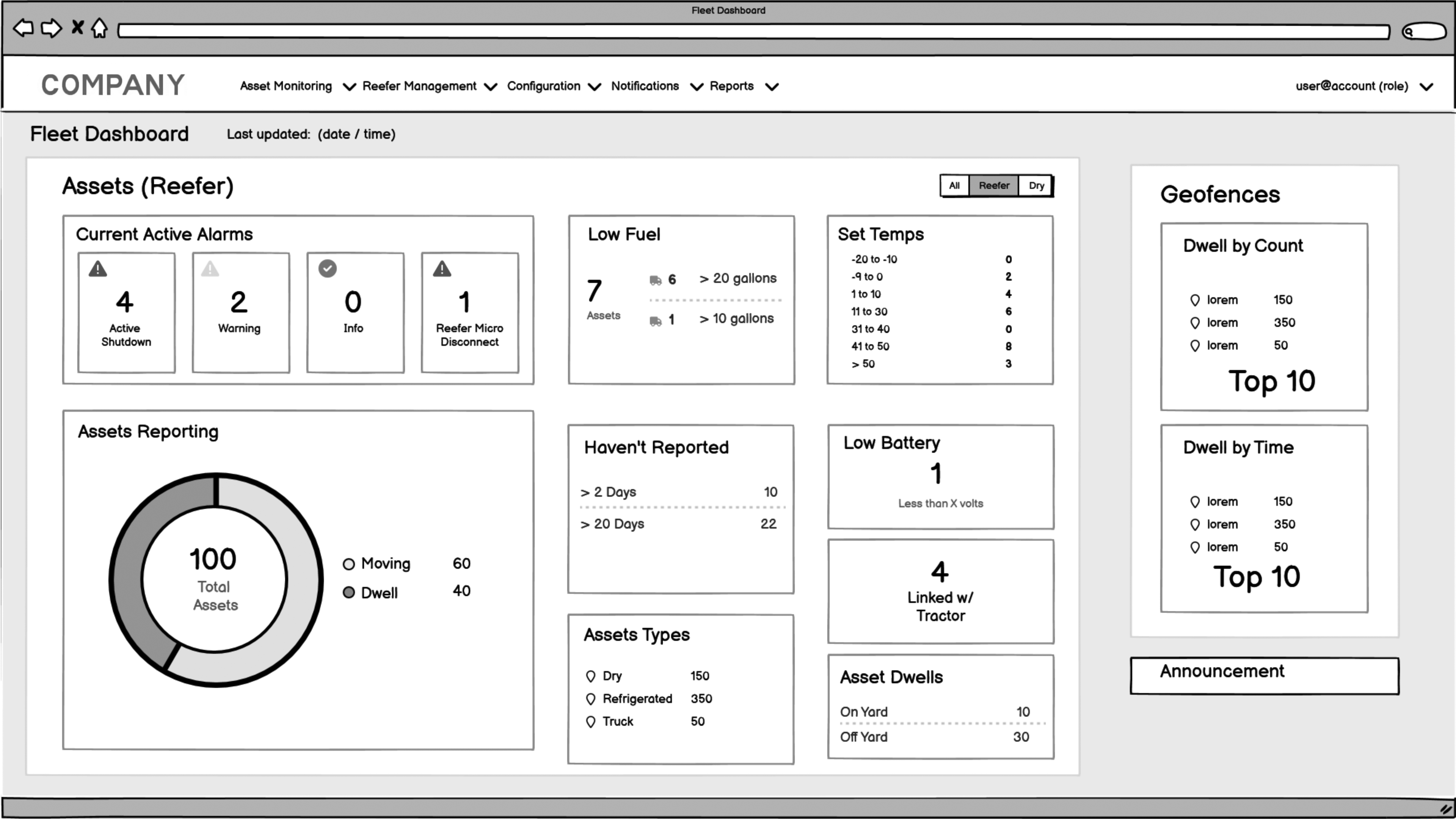
Fig 4: The reefer-specific dashboard prototype introduced role-based filtering and reefer-only data. The design included set point temperatures, reefer micro disconnects, and other data not relevant to dry fleets. -
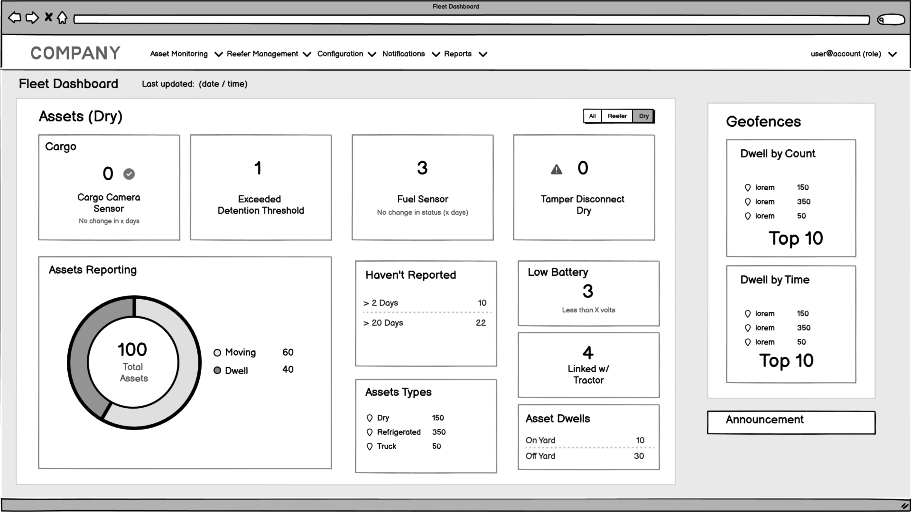
Fig 5: The dry fleet dashboard removed refrigerated-specific data to reduce noise and improve clarity. Users saw only relevant metrics like fuel sensors and cargo camera status, aligned to dry fleet operations.
Role-Based Defaults and Scalable Design
Alongside user-driven customization, we designed role-based default dashboards for Fleet Managers, Customer Support/Operations, and a general fallback view, based on interviews, SME input, and Pendo usage data. Each role saw a tailored view aligned to their tasks: dispatchers prioritized micro disconnects, while fleet managers focused on alarms and movement. Early wireframes explored general, reefer-specific, and dry fleet-specific layouts to validate role-based content needs. This helped define which cards should appear by default for each fleet type.
Filters and chips were dynamic based on fleet type (e.g. reefer-only accounts only saw reefer options), reducing noise and confusion. Users could also save a filter set as their default view to streamline daily use.
Version 1 supported show/hide card customization. Version 2, on the roadmap, would introduce drag-and-drop card reordering -- a SaaS-standard pattern for scalable dashboards. Designing for dynamic layouts while keeping the UI scannable was a key constraint throughout.
Every decision tied back to the same goal: eliminate report-hunting, improve visibility, and speed up decision-making for end users.
Key Findings and Insights
Research confirmed what users had expressed in interviews and what behavioral data from Pendo revealed: the report-based monitoring workflow was too slow, too fragmented, and not scalable for daily fleet operations inside the SaaS platform. These insights directly shaped the dashboard's structure, the decision to use modular cards, and the prioritization of alarm-driven workflows.
-
Fragmented Monitoring Was Slowing Teams Down
Users spent unnecessary time bouncing between the Reefer Status Report, Location Tracking Report, and other tools just to answer basic questions like 'Are there any shutdown alarms?' or 'Which assets aren't moving?' Pendo heatmaps and session replays showed repeated patterns of users visiting the same reports in sequence, which was clear evidence that the web app wasn't providing operational visibility efficiently. -
One-Size-Fits-None Was a Real Problem
Mixed fleet managers, reefer-only operators, and dry fleet dispatchers had radically different priorities. This wasn't anecdotal. It was validated through both interviews and behavior tracking. Some users focused entirely on reefer alarms. Others prioritized dwell time or cargo status. This directly validated the need for a modular, customizable dashboard, which is a common SaaS design pattern for B2B products serving multiple roles. -
Alarm and Triage Workflows Were Broken
Because no alarm summaries existed, users had to rely on filtered reports to investigate issues, which slowed triage and increased friction. This gap directly informed the decision to surface interactive alarm counts in the dashboard. Making the alarm cards clickable enabled faster task completion and aligned with SaaS UX standards for efficient workflows. -
Workflow Inefficiency Had Measurable Impact
Time-on-task analysis confirmed the opportunity for improvement. Compared to the legacy report-driven workflow, the dashboard reduced the number of steps required and significantly accelerated how quickly users could identify and respond to critical issues. This directly justified the 50% reduction in workflow steps and 30% faster issue identification metrics.
Key Pain Points
Pain Point
No Real-Time Visibility
Users had to rely on multiple static reports with manual filtering to check alarms, movement, and dwell time, slowing response time and increasing missed issues.
Pain Point
Inefficient, Multi-Step Workflows
Checking for shutdown alarms required 4-5 clicks across separate reports. This repetitive process made critical monitoring harder than it should be.
Pain Point
One-Size-Fits-None Dashboard
Mixed-fleet, reefer-only, and dry fleet users needed different views, but the platform had no way to surface personalized, role-specific data in one place.
Solutions and Recommendations
Guided by user research, product analytics, and usability testing, the solution focused on 3 key areas: streamlining workflows, improving operational visibility, and designing for scalability within a SaaS enterprise product. Each design decision was directly tied to measurable impact, including the 50% reduction in workflow steps and 30% faster issue identification.
Streamlining Operational Workflows
-
Surfacing Key Data in One Place
The dashboard prioritized the data users checked most often, alarms, movement status, and dwell time, giving them a real-time operational view without jumping between reports. -
Clickable Alarm Cards
The Active Alarms card displayed all key alarm types in one place. Clicking a count, like '16 Shutdown,' filtered the report to show those assets, replacing multi-step report navigation. -
Reduced Cognitive Load
Instead of manually filtering and cross-checking reports, users could now scan their fleet's real-time status at a glance. This directly contributed to the 30% faster issue identification metric.
Improving Operational Visibility
-
Modular, Role-Relevant Alarm Cards
The dashboard showed the most critical data -- shutdowns, reefer micro disconnects, dwell, and movement -- in modular cards based on each user's role. This replaced report-hunting with a visual snapshot of fleet status, improving clarity and response time. -
Real-Time Fleet Health Snapshot
The dashboard provided an instant overview of alarms, asset status, and movement patterns. This visual snapshot supported proactive monitoring and triage, replacing reactive report-hunting. -
Usage-Driven Prioritization
Pendo usage data revealed which alarms and metrics were accessed most frequently. This informed which cards were prioritized higher in the layout -- surfacing the most operationally critical data first.
Design for Flexibility and Scalability
-
Role-Based Default Dashboards
Defaults were created for Fleet Managers (Alarms, Movement, Dwell), Customer Support / Dispatch (Alarms, Reefer Status, Micro Disconnects), and a General fallback (Basic alarms and movement). This SaaS-native pattern supported faster onboarding and reduced setup friction. -
Role-Aligned Default Content
Default dashboards were tailored by user role (Fleet Manager, Dispatch, Operations). Each included the top alarm and status cards most relevant to that role, minimizing noise and setup time. -
Customizable Card Visibility
Users could show or hide dashboard cards based on role, fleet type, or personal preference supporting operational flexibility without overwhelming the UI. -
Roadmap: Drag-and-Drop Card Ordering (Version 2)
While Version 1 focused on card visibility, user feedback and engineering collaboration shaped a roadmap for drag-and-drop card positioning in Version 2. This required thoughtful grid behavior rules to maintain clean, responsive layouts with variable card sizes.
Interaction Design Enhancements
-
Clickable Data Patterns
All alarm counts and key metrics became interactive, reflecting SaaS UX standards where summary data leads directly to filtered views or actionable lists. -
Error Prevention for Device Disconnects
Visual cues for critical states like 'Reefer Micro Disconnect' or 'No Movement' reduced missed events and improved response time. -
Responsive Layout Considerations
The dashboard used flexible grid rules that scaled for different screen sizes and asset counts. While not mobile-first, the design accounted for accessibility contrast standards and ensured key workflows remained usable on smaller screens.
Future Vision: Smarter Operations
Long-term, the design foundation enables AI-driven insights like predictive fleet health, proactive alerting (e.g. 'high dwell risk'), and smart recommendations based on usage patterns. This direction aligns with enterprise SaaS trends focused on decision intelligence and proactive operations management.
-
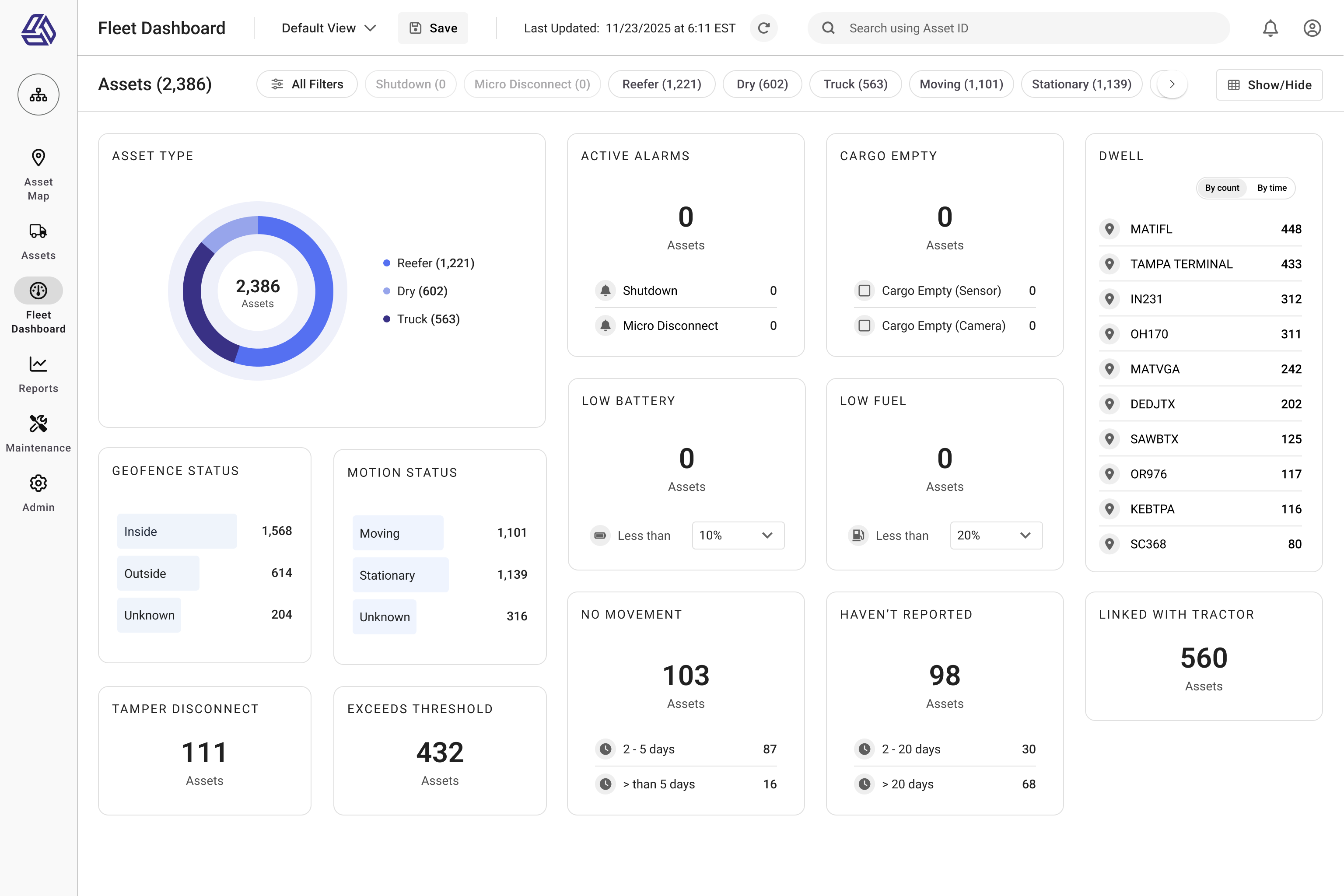
Fig 7: The Fleet Dashboard mockup highlights how users can access key operational data without navigating multiple reports. Card-level interactions replaced report filtering and search tasks, and the updated global navigation improved access to high-priority fleet tools. -
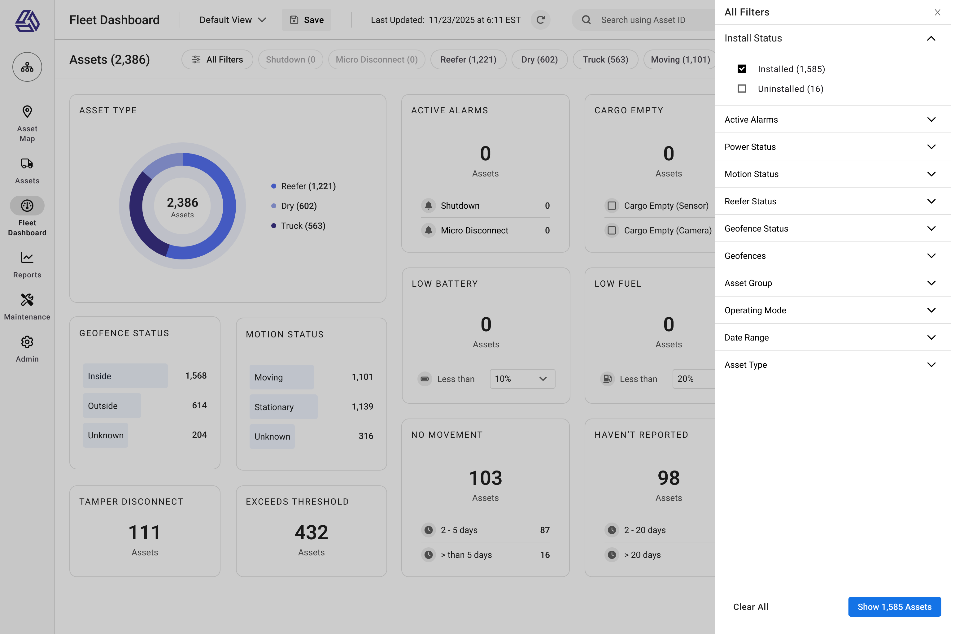
Fig 8: The filter panel lets users refine results by alarm type, motion status, asset group, or custom parameters. This view shows the dashboard in an all-clear state with filters visible supporting both passive monitoring and targeted triage within the same workflow. -

Fig 9: When alarms are present, the dashboard prioritizes them with high-contrast cards, enabling fast triage. Alarm types like Shutdown and Micro Disconnect are clearly separated and clickable, aligning with SaaS UX patterns for filtered drilldowns. -
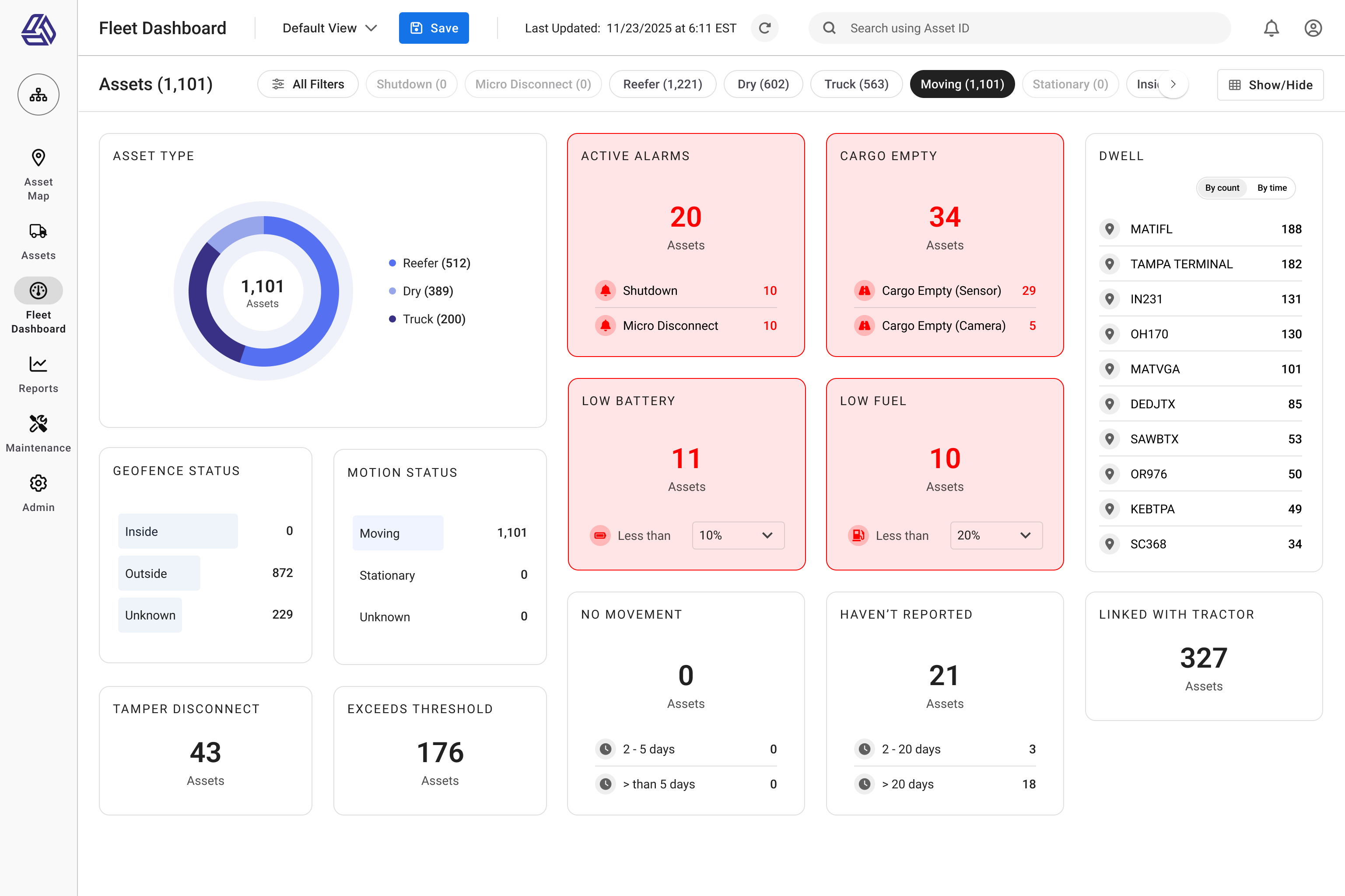
Fig 10: Filtering to "Moving" assets updates the dashboard to show only relevant metrics, hiding stationary-related cards. This role-driven filtering model supports use cases like dispatch or operations teams monitoring assets in transit.
Impact and Results
The dashboard delivered measurable improvements to both operational efficiency and user experience. It replaced fragmented, report-driven workflows with a real-time operational view that became the most-used page in the SaaS platform within a month.
-
50% Fewer Workflow Steps
Task flow analysis confirmed the dashboard reduced alarm checks from 4 steps to 2, which saves time on every task that previously required manual report navigation and filtering. -
30% Faster Issue Identification
By eliminating report-hunting and surfacing key data visually, users were able to detect alarms and operational issues 30% faster, which we validated through Pendo time-on-task analysis. -
80% Reported Improved Fleet Visibility
Post-launch surveys confirmed that 80% of users felt the dashboard improved their ability to monitor fleet health and respond to operational issues in real time. -
Most-Visited Page in the SaaS Platform
Pendo analytics showed the dashboard became the platform's #1 most-visited page within the first month of release, which -- proof of high adoption and user value.
The combination of research-driven design, role-based defaults, and SaaS-native interaction patterns not only improved the day-to-day experience for fleet managers and customer support teams, but also set a foundation for scalable, data-driven operations across the platform.
I can log in and see right away: what's moving, what's not, and what's broken. That's huge for us.
— Post-launch user survey response
Conclusion and Lessons Learned
This project transformed a fragmented, report-driven workflow into a real-time operational dashboard improving visibility, reducing workflow friction, and delivering measurable gains in efficiency for fleet operations teams.
Key Lessons
-
Data-Driven UX Drives Better Outcomes
Combining qualitative research with SaaS product analytics ensured the design solved real-world pain points not assumptions. This directly influenced the 50% reduction in steps and 30% faster issue identification. -
Designing for Flexibility is Crucial in B2B SaaS
Role-based defaults paired with modular customization balanced the needs of mixed fleets, reefer-only operators, and dispatch teams -- a key lesson for any scalable enterprise UX. -
Close Collaboration with Engineering is Non-Negotiable
Designing for dynamic layouts, responsive behavior, and future drag-and-drop customization required deep collaboration with developers from the start not after handoff. -
UX Leadership Means More Than Screens
This wasn't just UI design. It was product strategy, problem framing, and driving decisions across product, engineering, and operations ensuring the solution fit user workflows and business goals.
Beyond improving day-to-day fleet operations, this project strengthened the platform's foundation for scalable, real-time visibility and reinforced the value of UX leadership in driving measurable outcomes for SaaS products.