Bringing Critical Alerts to Mobile
As Lead UX Strategist, I designed a mobile app that brought the ability to acknowledge and assign critical alerts into the field helping teams respond faster and reduce operational risk.
Project Overview and Summary
I led the end-to-end UX strategy and design for a mobile app that empowered field personnel and fleet managers to respond to critical asset alarms from anywhere. This initiative moved key alert-handling tasks from a complex desktop platform to a focused, on-the-go experience, directly addressing the need for mobile access to time-sensitive data.
This case study details how we defined and delivered a scoped, high-impact MVP built for speed, clarity, and future scalability.
-
My RoleLead UX Strategist and Lead Product Designer
-
TeamCross-functional team including CTO, Product Manager, Engineering Lead, Data Analysts, and Field Stakeholders
-
ToolsUser Interviews, Journey Mapping, MVP Scoping, Figma, Balsamiq, Material Design 3.
-
Timeline3 Months (MVP)
-
Business GoalsProvide on-the-go visibility for critical fleet data, reduce operational risk by enabling faster alarm response, and improve field personnel efficiency.
-
Key User and Business Problem SolvedDesigned a mobile app that let field teams acknowledge, prioritize, and act on alarms in real time without needing access to the desktop system.
The Challenge: A Desktop-Bound Workflow for Users in the Field
The desktop platform worked well for in-office teams but left a gap for anyone away from a desk -- including field technicians and mobile fleet managers. Without mobile access, teams couldn't respond in real time, which led to communication breakdowns and slow resolution during critical events.
-
Delayed Responses Created Risk
Alarms often went unanswered for 15-30 minutes because no one could act on them away from their desk. This delay increased the risk of cargo spoilage, missed service windows, and frustrated customers. -
Reduced Field Efficiency
Teams relied on calls, texts, and back-and-forth confirmations to respond to alarms often duplicating effort or missing key steps. Something as simple as acknowledging an alarm required logging into a desktop system. -
Poor User Experience and Frustration
There was no way to assign or acknowledge alarms from the field, which meant technicians and managers received repeated alerts with no visibility into who was taking action. This led to confusion, missed handoffs, and repeated follow-ups.
If I get an alert while I'm on the way in, I have to call around to find someone who can check it. There's no way to take care of it myself. And then I still get follow-up texts, even after someone's already dealt with it, because the system doesn't know it's been handled.
— Fleet Manager, during initial user interviews
The Approach: Defining a Task-Oriented MVP
I focused the UX strategy around one clear goal: help teams respond to alarms in real time without a desktop. That meant defining a tightly scoped MVP, grounding it in actual workflows, and choosing a design foundation we could scale over time.
Focused MVP, Defined by Roles
We narrowed the MVP to one critical job: handling alarms on the go. Our research pointed to two roles central to this flow: Fleet Managers, who monitor and initiate response, and In-Terminal Service Managers, who resolve issues on-site. Designing for both meant the app could cover the full response cycle from alert to action (Fig 1).
Supporting both roles let us cover the full response cycle from getting the alert to taking action. It made the MVP immediately useful while setting us up for future growth.
Establishing the Foundation
To move quickly without sacrificing quality, I built on proven UI foundations and adapted them to fit the use case.
-
Material Design 3 and Google Maps Foundation
I used Material Design 3 as the baseline and customized it to match our internal UI. Since location was critical, and Google Maps was already familiar from the desktop, we built around Google Maps as the primary interface to keep alarm context and asset visibility clear. -
Cross-Functional Collaboration with Engineering
I worked with engineering early to align interaction patterns with platform limits. When we explored real-time geofencing, they flagged constraints that shaped how we showed asset updates. This kept the design clean and reduced rework.
Research and User Insights
To ground the project in real needs, I interviewed Fleet Managers and Maintenance and Repair (M&R) teams to walk through how they handled alarms today: what triggered them, how they responded, and where things broke down.
Key Insights from User Research
The interviews surfaced four key needs that shaped the MVP.
-
Users Needed Mobile Access, Not Just Alerts
Teams got alerts by SMS, but couldn't view details or take action without returning to a desktop. This was their biggest frustration. They could see a problem, but couldn't do anything about it. -
No Way to Acknowledge Alarms
Users kept getting alerts for alarms that were already being handled, which wasted time and created confusion about ownership. They wanted a quick way to mark an alarm as in progress so others wouldn't follow up unnecessarily. -
Search Had to Be Flexible
Users needed to find assets by ID, booking number, geofence, or even by vessel. Search had to work how they worked. -
Familiar UI Meant Faster Adoption
Users wanted the app to feel like tools they already used. Google Maps came up often in interviews as the most familiar and trusted map UI, and it was already part of the desktop platform. That made it a natural anchor for the mobile experience. Material Design 3 gave us a clean, consistent foundation that was fast to learn and easy to trust.
Key Pain Points
Pain Point
No Way to Act on Alarms from the Field
Users received SMS alerts but couldn't view alarm details, assign ownership, or resolve issues without going back to a desktop system.
Pain Point
Duplicate Alerts, No Clear Ownership
Without acknowledgment, teams got repeat alerts, even after someone took action. This caused confusion and wasted time.
Pain Point
Critical Info Buried in a Complex UI
Users had to dig through complex desktop views. They just wanted to see what was wrong, where it was, and who was handling it.
The Final Solution: A Task-Oriented Mobile Experience
The final design is a native mobile app built for speed and clarity. It gives field teams just enough context to act fast. A user gets a push notification, opens the app, sees the alarm on the map, and can review details or assign it in seconds.
Iterating on the MVP Flow
We started with a list-first layout, sorted by severity. But early feedback from field teams showed they prioritized spatial context and wanted to see where the issue was first. So we flipped the layout: the map became the focus, with a bottom sheet for quick response. That shift made it faster to understand and reduced task switching.
Testing and Iteration
I tested early prototypes with Fleet Managers and In-Terminal Service Managers, and walked through flows with internal ops and support teams. Their feedback confirmed that the map-first layout worked better in the field. We also tested the alarm acknowledgment flow to make sure the language and steps were clear without needing extra training.
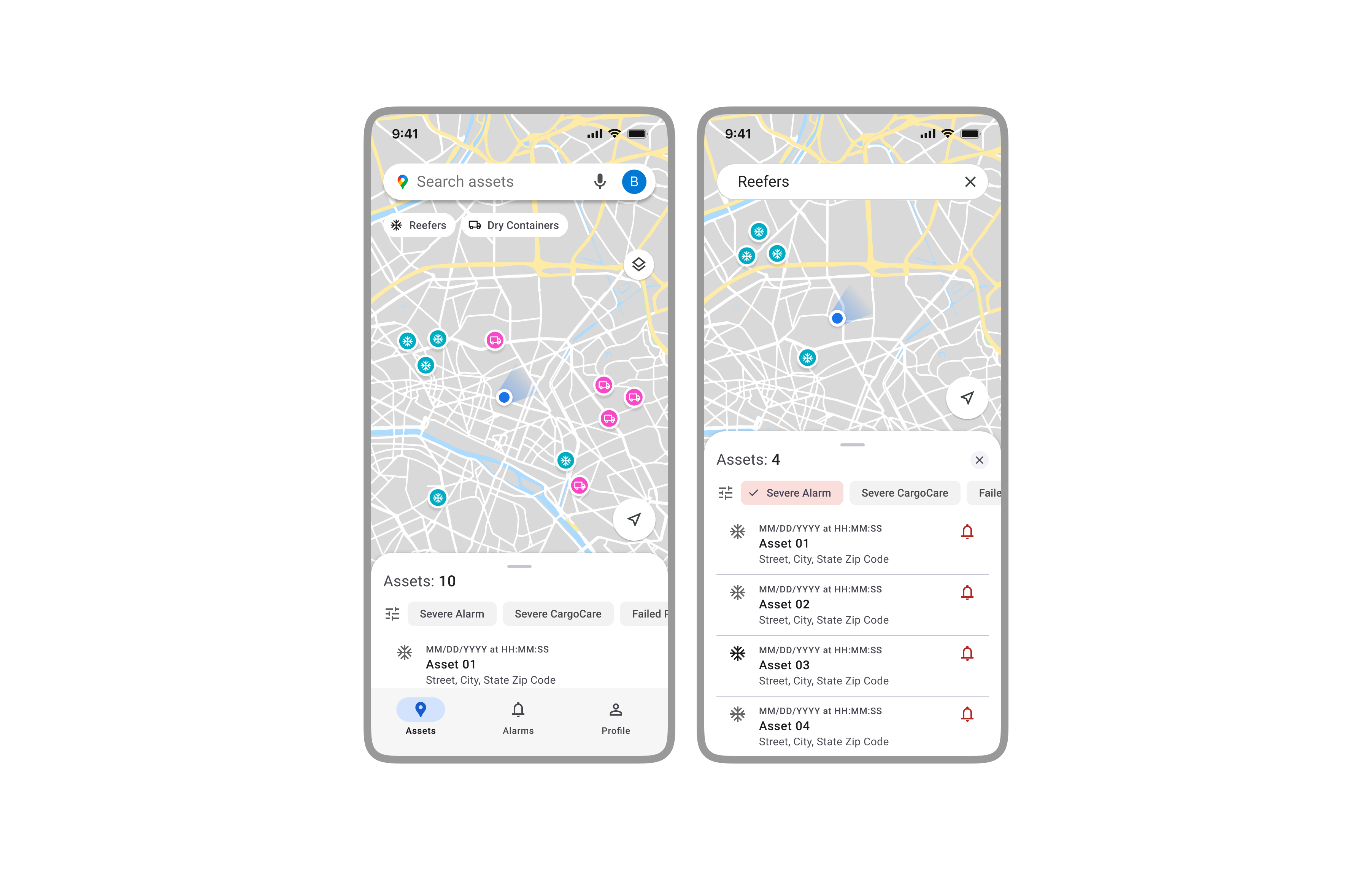
The Map-Centric Dashboard
Users told us they were more comfortable starting with the map view, so we made it the default. It gives instant context and keeps users oriented. A persistent bottom sheet shows all visible assets, so they can handle alerts without switching views (Fig 2).
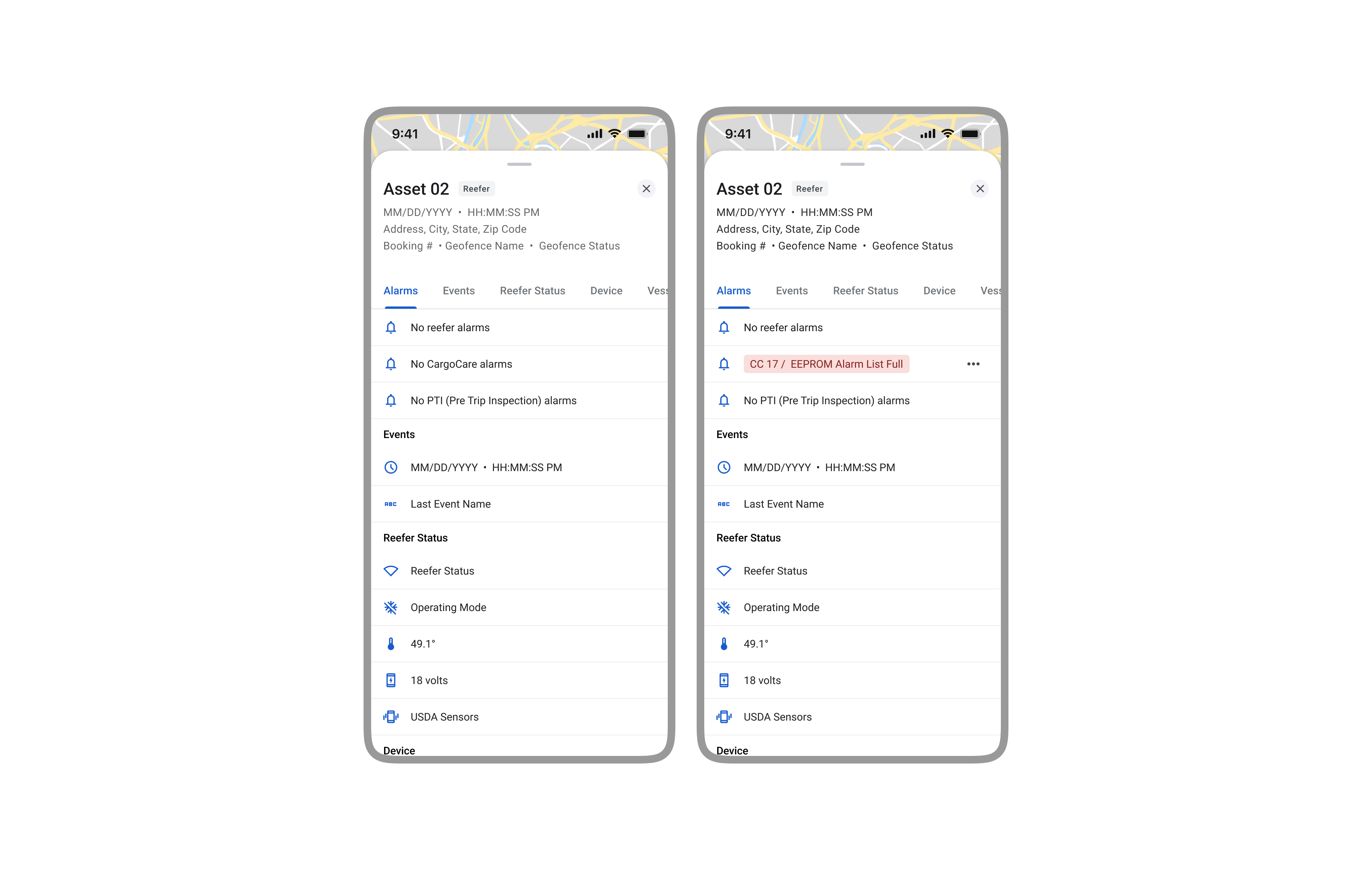
The Asset Detail View
Tapping an asset opens a detail view with the most critical info at the top. Alarm status comes first, followed by key reefer data like temperature and set point. This layout lets users check asset health at a glance (Fig 3).
The screen shows both alarm details and live operational data like voltage, temperature, and location. Alarms are grouped by type (Reefer, CargoCare, PTI) so users can quickly see what needs attention without jumping between screens.
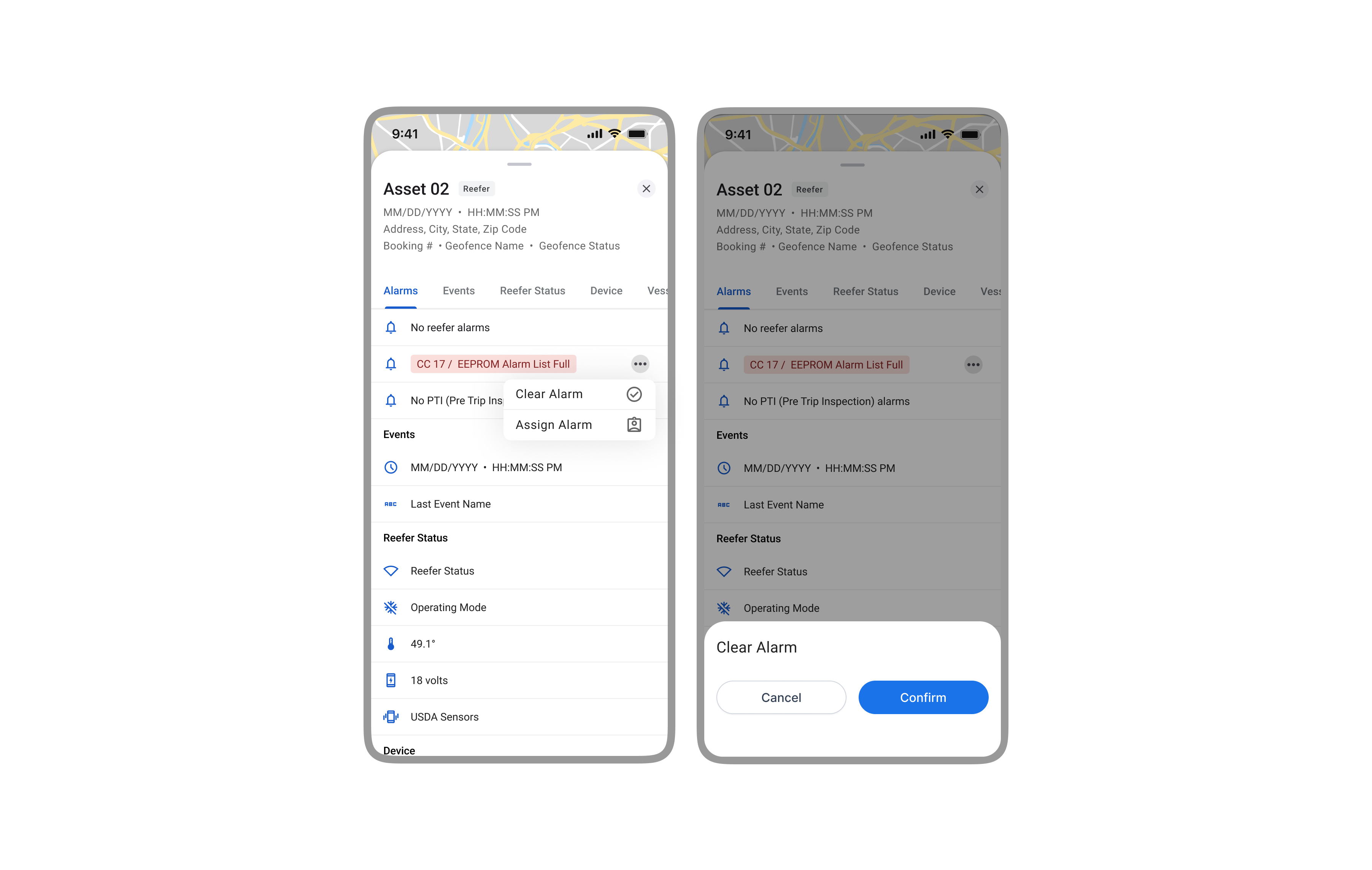
The Alarm Acknowledgment Flow
To speed up response time, we added inline actions to clear or assign alarms right in the asset view. A simple menu keeps the UI clean, and a quick confirmation helps prevent mistakes without slowing things down (Fig 4).
To cut down on alert fatigue, we designed a clear way to acknowledge alarms. Marking an alarm as "being handled" stops duplicate notifications from going out to the team. The flow is simple and quick to complete.
Accessibility Considerations
We designed with accessibility in mind, knowing the app would be used in the field. Interactive elements were sized for touch, and alarm colors were tested to meet contrast standards so key info stayed clear and readable.
Projected Impact and Outcomes
Since the MVP was handed off before launch, these are the projected outcomes based on our user research and goals aligned with leadership.
-
Reduced Operational Risk
Giving teams a way to respond from anywhere was expected to cut critical response time and reduce the risk of cargo loss or missed service windows. -
Increased Field Efficiency
The mobile flow replaced time-wasting workarounds like phone calls and desktop logins. We expected it to boost daily output and save teams from repetitive follow-ups. -
Foundation for Future Scalability
The MVP was built to scale, with room for future features like commands and support for more user roles, without needing a full redesign later.
While usage data wasn't available at the time of handoff, leadership aligned on three target outcomes to define MVP success: reduce average alarm response time by 50%, cut unacknowledged alert duplicates by 40%, and enable 75% of alarm handling to be done on mobile. These KPIs were set as benchmarks for adoption and operational ROI.
Conclusion and Reflections
This project turned a complex enterprise workflow into a focused, mobile-first tool by staying grounded in the real-world needs of field teams. We defined a clear MVP that solved a core business problem and created a strong foundation to build on.
Key Takeaways
-
Start with a Focused MVP, but Design for Scale
This reinforced the value of starting small with a clear use case and real user roles. By considering secondary personas early, we kept the design flexible enough to grow with future needs. -
Early Collaboration with Tech Leadership is Key
Working with the CTO and engineering leads early gave us visibility into platform limits and the roadmap. That partnership made the solution both user-centered and technically realistic. -
Leverage Existing Systems to Accelerate Design
Material Design 3 and Google Maps let us move fast without starting from scratch. Customizing them to fit our internal UI gave us a clean, consistent experience that felt familiar, trusted, and on-brand.